GARDN Festival
A digital data visualization experience that transforms a dataset into an interactive, exploratory kiosk-based interface, designed through team collaboration over a course of 5 weeks. Featured is a comprehensive UX case study with prototype demos.
Team
Erin Ye — Research, Prototyping, & Graphics
Ella Thompson — Research, Prototyping, & Graphics
Table of Contents
“We are designing for a festival attendee who struggles with navigating new spaces because of complicated venue layouts, crowded spaces, and a lack of engaging event features.”
The Brief
We were tasked with creating a product for a demographic with overlooked needs based on 3 main identifiers.
Scenario // Festival or large public event
Persona // The first-time navigator
Modifier // Engaging
We wanted to re-envision the festival experience by creating a tool that helps first-time navigators who may feel unsure about how to move through the space, while also elevating the overall experience of music festivals and other public events by creating an experience that encourages exploration and engagement while helping users feel more comfortable navigating the festival grounds.
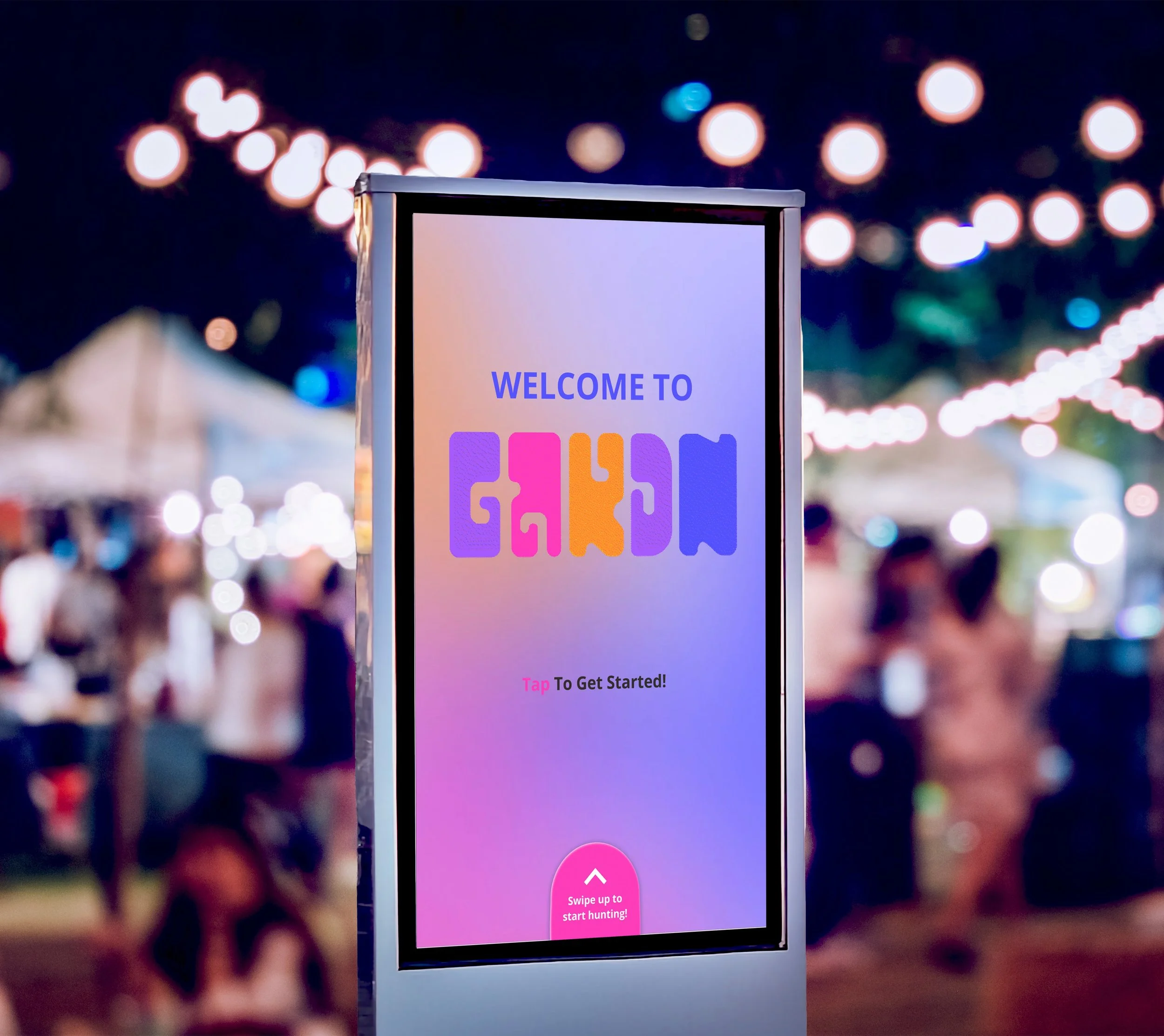
GARDN introduces a new way to experience live music. It provides guidance on venue locations and lineup information while offering an engaging, low-cost secondary activity that helps users feel more immersed in the festival experience.
The Problem
Ineffective Wayfinding
Large music festivals often have complex layouts and crowded environments. First-time attendees can struggle to understand where stages, kiosks, and activities are located, making navigation confusing and stressful. From our initial research, we found that around 53% of visitors experience navigation problems at large venues.
1
Downtime
Breaks between performances can leave attendees with little to do. Without engaging activities, festival-goers may feel bored or disconnected while waiting for the next set to begin. We found that about 75% of attendees lose attention or engagement during sessions or downtime.
2
Engagement
Many festival experiences only focus on performances. They often lack interactive features that encourage exploration, making it harder for attendees to fully engage with the space and overall festival experience. On average, around 70% of festival attendees say they value the overall experience more than the music lineup.
3
The Solution
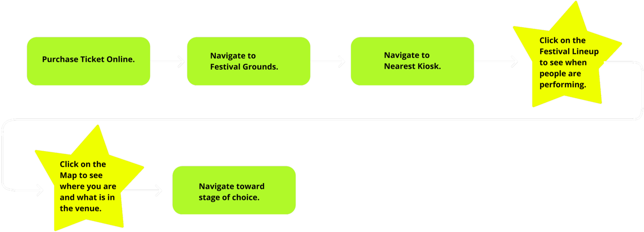
Festival Map Navigation
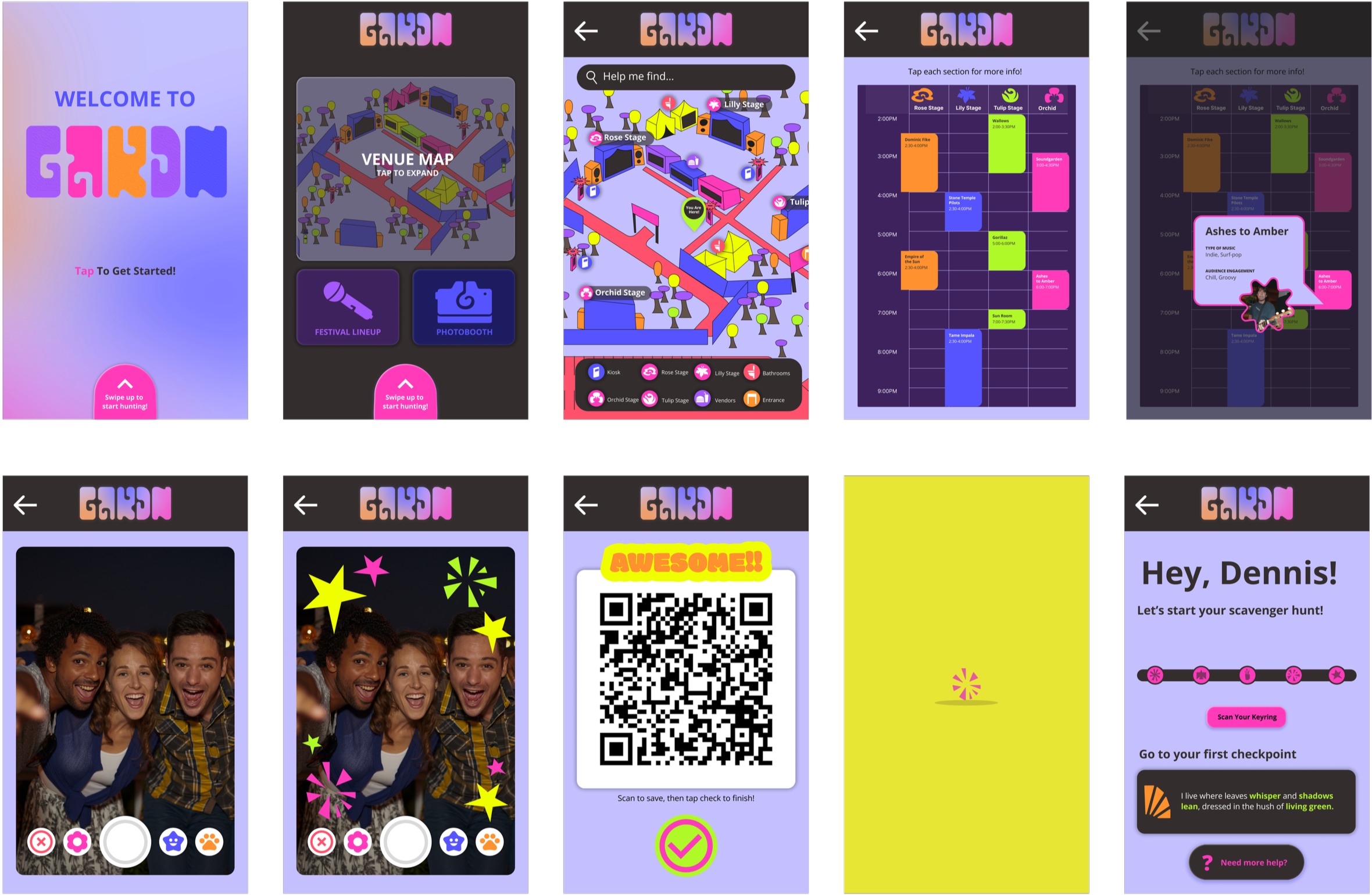
We created our festival map using recognizable icons and a recommended navigation bar. This allows for new festival attendees to quickly understand the venue layout and navigate the new space.
Photo Booth & Festival Info
Our festival info page displays festival lineup and the type of crowd or atmosphere they attract to boost attendee confidence in the performers they want to see, preparing them for the type of crowd at each stage. For fun and simple engagement, we created a photobooth feature with visually playful filters consistent with festival iconography.
Our solution was to was to implement an interactive multi-kiosk system with clear, eye-catching visuals that helps attendees navigate the festival more effectively. Our kiosks would offer simplified wayfinding to boost confidence for new users navigating an unfamiliar space, and would also offer simple and extensive activities to create a more immersive, overall experience.
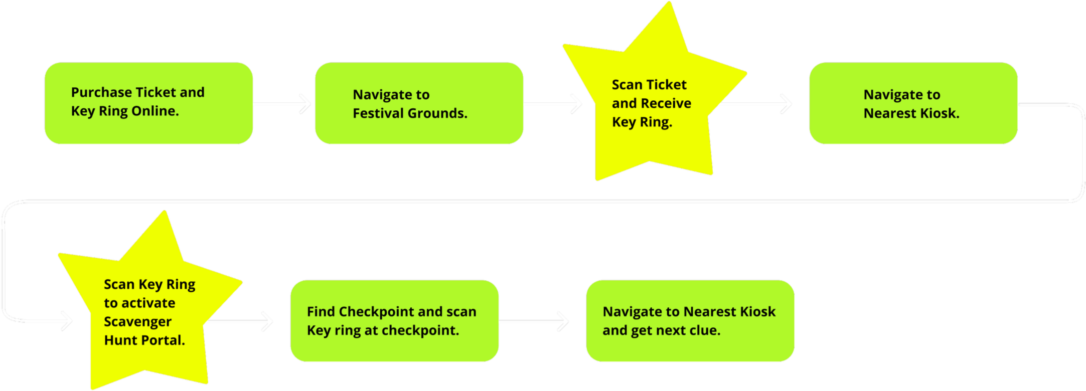
Scavenger Hunt Navigation
To make the overall experience of the festival more immersive we created a Scavenger Hunt. This feature guides users through the environment while adding a playful, engaging layer that motivates discovery and interaction throughout the festival.
Using a key chain with a touchless scan feature, users can access their personal profiles to track their progress and win a prize upon completion.
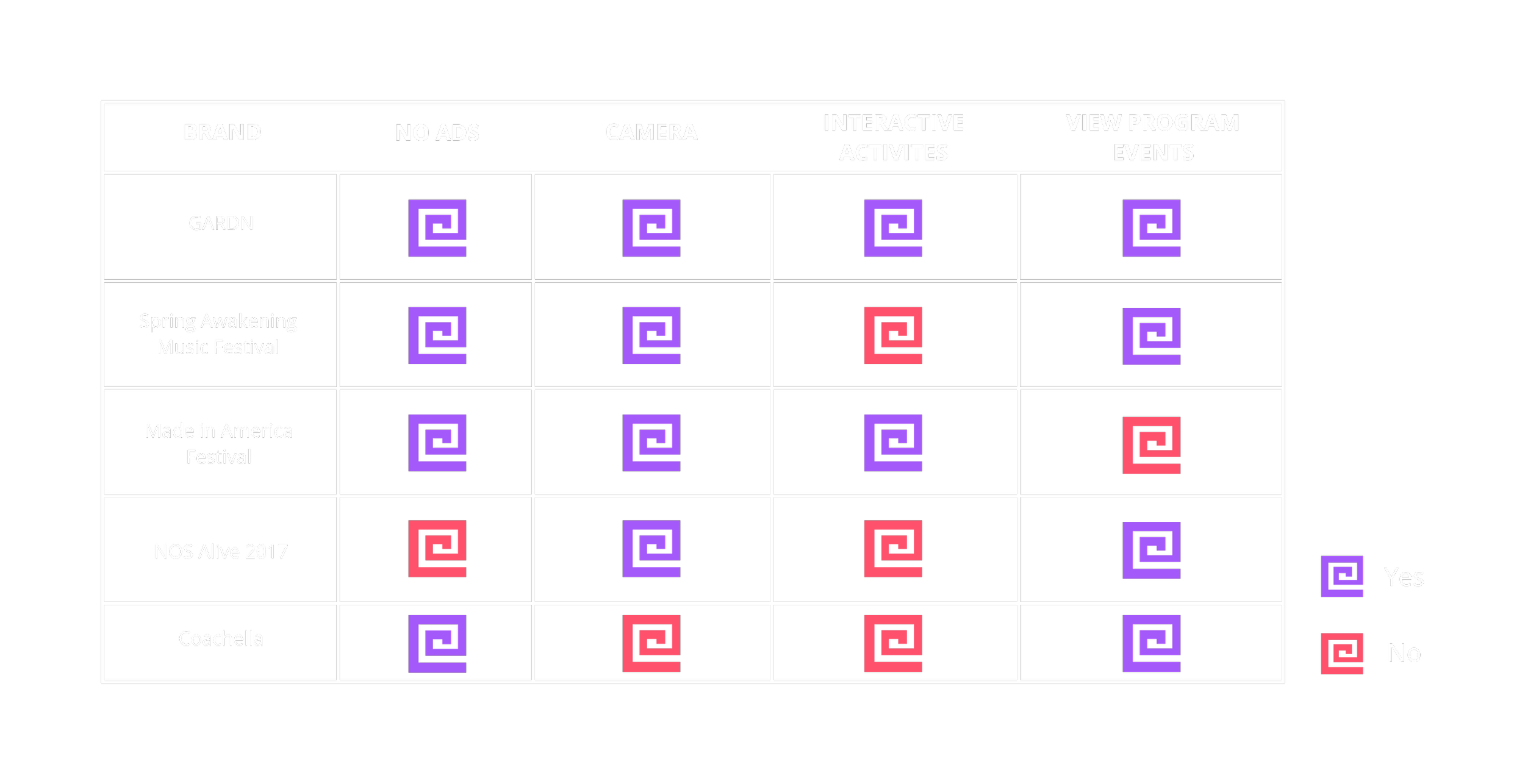
Competitor Research
Spring Awakening Music Festival
The Spring Awakening Music Festival is an annual electronic dance music (EDM) festival held in Chicago, Illinois. Their events feature informational event apps, and interactive sponsor opportunities which include a “selfie” photo feature. The selfies have a branded frame that fans can share via email or Facebook.
Made in America Festival
The Made in America Festival is a 2 day music festival held every Labor Day weekend in Philadelphia, Pennsylvania. They have curated interactive features that include designated spaces for art installations, photo opportunities, and “Window Walls” which are large screens that allow for real-time interaction with crowds at other festivals.
NOS Alive 2017
NOS Alive is an annual music and arts festival that is held in Portugal. In 2017, they collaborated with PARTTEAM & OEMKIOSKS to bring interactive digital kiosks to their event. These kiosks featured the ability to take selfies, a view of the event program, a map of the venue space, transportation timetables, and more.
Coachella
The Coachella Valley Music and Arts Festival is an annual event that serves as a showcase for visual arts. They require attendees to register for their RFID wristbands. With these wristbands, users are able to access their “Live Click” feature at various touch points throughout the festival grounds, which automatically updates their Facebook status.
Tarot Cards of Tech: The Superfan

Passionate User Behavior
The user would look forward to festival itself annually, specifically so they could participate in the event.
Subverted Rules of Engagement
The point of the activity is to consistently check in with the kiosk, user could subvert this by trying to go to every tent they could to scan key ring wherever they can and then check in at the kiosk for their prize.
Community (Asset//Liability)
An asset would be word-of-mouth and hype around the festival. A liability would be that the user doesn’t like the prize or other external factors outside of the venues control.
Communicative Discourse
Users could complain about checkpoints or other related tasks. Shared personal experiences can affect others’ impressions of festival and activity. Users could discuss via online forums on what prizes could be, increasing hype surrounding the festival.
Interview Takeaways
Based on our conducted interviews, we found that most festival-goers tend to rely on maps to navigate a venue space, that they want more to do besides watching performances, and that kiosk-users tend to prefer looking at visual information rather than reading information. With kiosks, users tend to enjoy hands-on interaction where they receive immediate feedback upon completing an action.
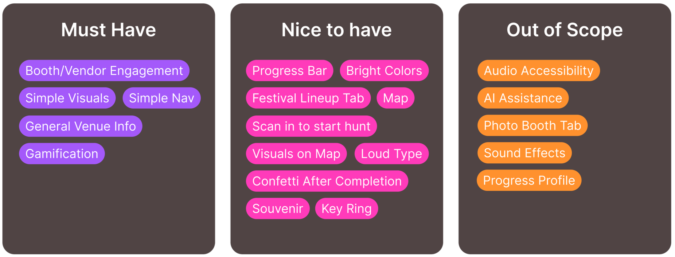
Pain Points & Opportunities
Navigation is unclear or completely missing in events.
1
Lack of things to do other than buy food or use the bathroom.
2
Kiosk navigation is unreliable, unclear, and cheap.
3
Merchandise, food, and other activities at festivals are too expensive.
4
Establish multiple locations where clear navigation is shown.
1
Provide an event/activity that can last the entire festival.
2
Clarity through intuitive design and effective informational hierarchy.
3
Provide an affordable activity to do that can last the entire festival.
4
GARDN’s Target Audience
Our target audience is individuals who are looking for a festival experience and want ease, affordability, and engaging ways to explore and enjoy the event.
Concepting & Information Architecture
Concept 1
Exploring the Venue
“An experience that helps users sample booths at a large event or festival by creating a gamified experience that encourages users to explore the venue through completing gamified tasks, without fear of getting lost.”
Concept 2
Immersive Add-On
“An experience that helps users connect to the event’s true intention by creating sensory installations that encourage fulfillment of the event’s mission, without being difficult to understand or navigate for new users.”
Concept 3
Venue Mapping
“An experience that helps users navigate a large venue by simplifying and expanding mapping and directions without overcomplicating navigation and deterring new attendees from engagement.”
GARDN’s kiosk feature is an exploration-driven interface with intuitive wayfinding. Our siosk is designed to be intuitive and welcoming for a variety of users, encouraging interaction and exploration from users navigating unfamiliar venue spaces through a dedicated scavenger hunt activity.
GARDN is designed for a large variety of users with ease and exploration in mind.
Our kiosks feature maps and various points of engagement to boost confidence in new attendees.
User flows and scenarios take into account how festival-attendees might move in between stages, participate in the scavenger hunt activity, and engage with booths during downtime.
Defining Personas & User Flows
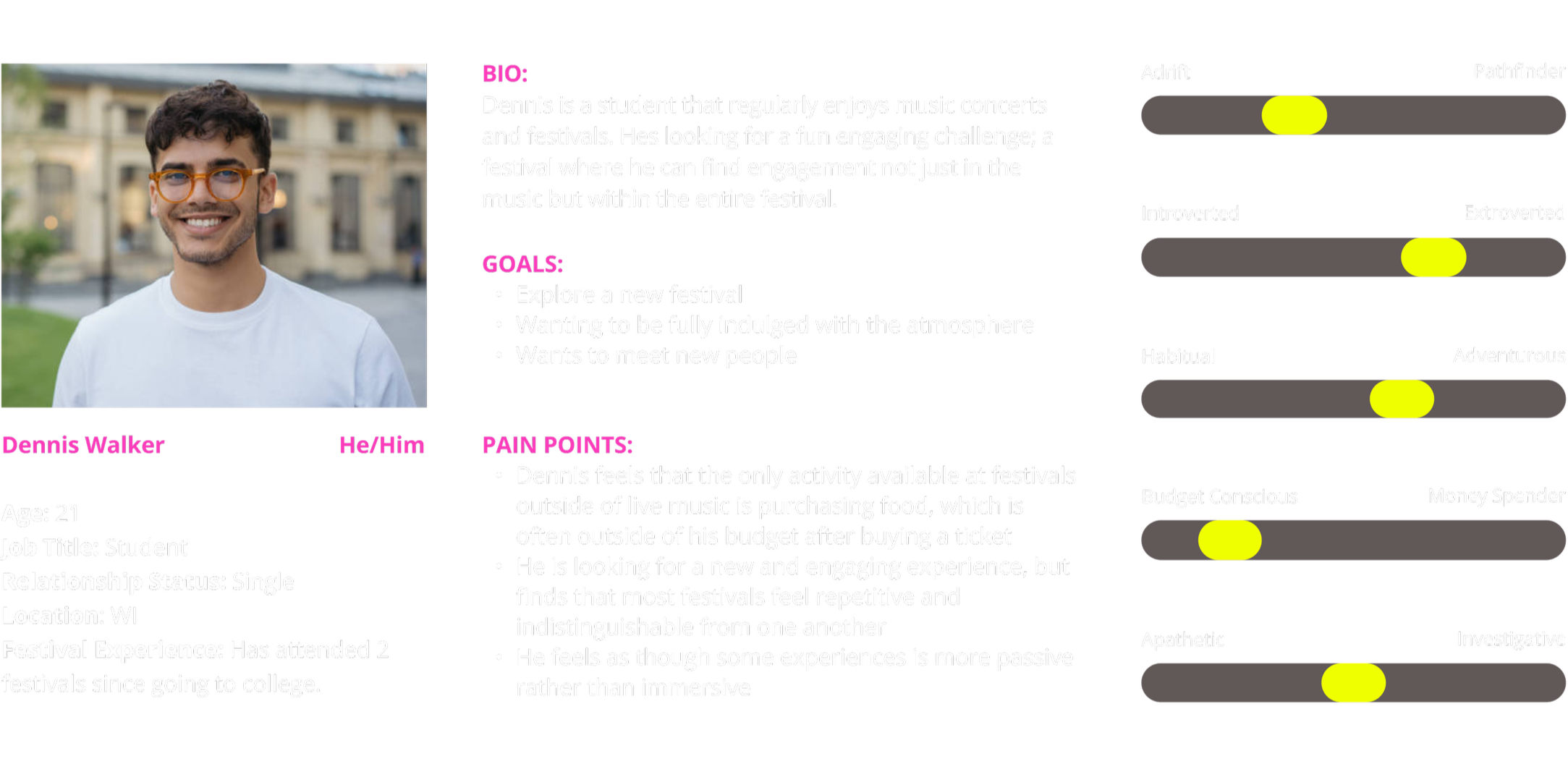
Our User Persona: Dennis Walker
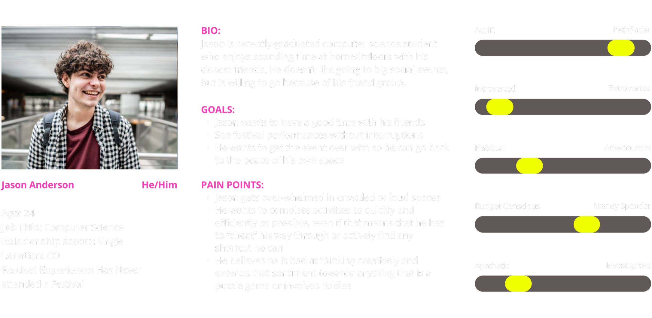
Our Negative User Persona: Jason Anderson
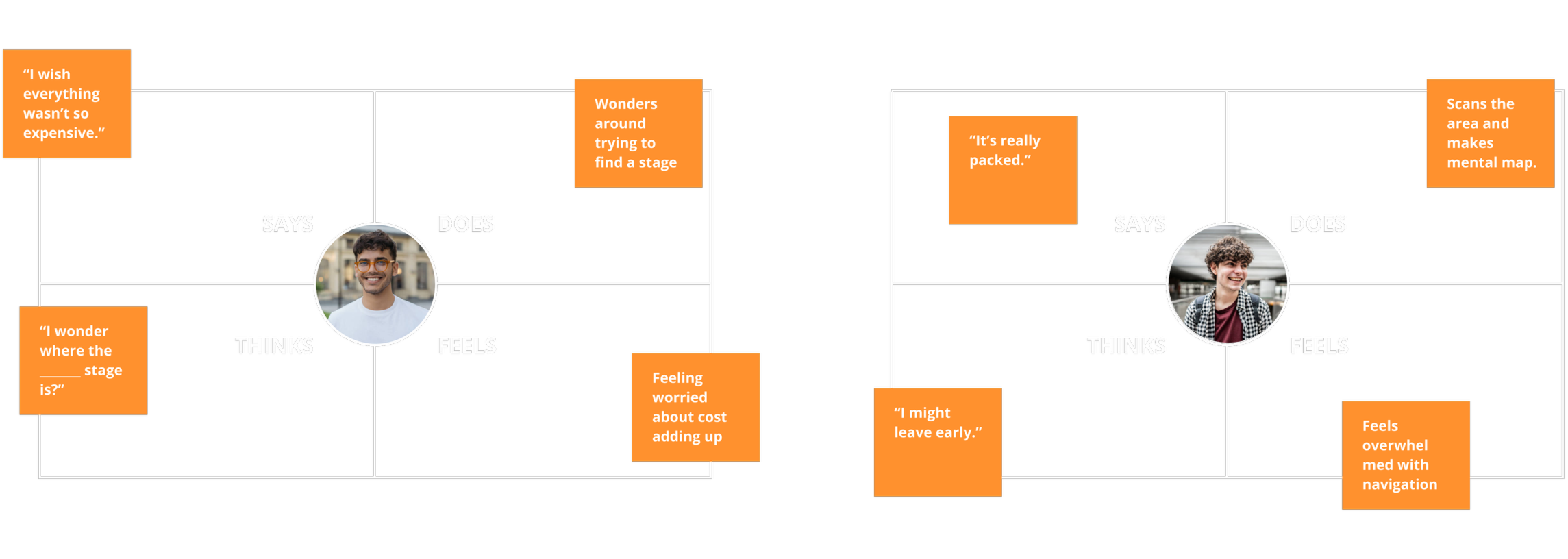
User Persona Empathy Maps
Scavenger Hunt User Flow
Festival Navigation User Flow
GARDN’s Visual Design
For GARDN, we felt that a loud, bright visual approach would be best. We refined this idea to better match the audience and energy we were designing for. After viewing the visual aesthetics of our competitors and other music festivals, we landed on a visual style that incorporated the features we loved from our initial inspirations and explorations. Our design is bright and colorful, focused on ease and exploration, and crafted to feel approachable within the festival environment.
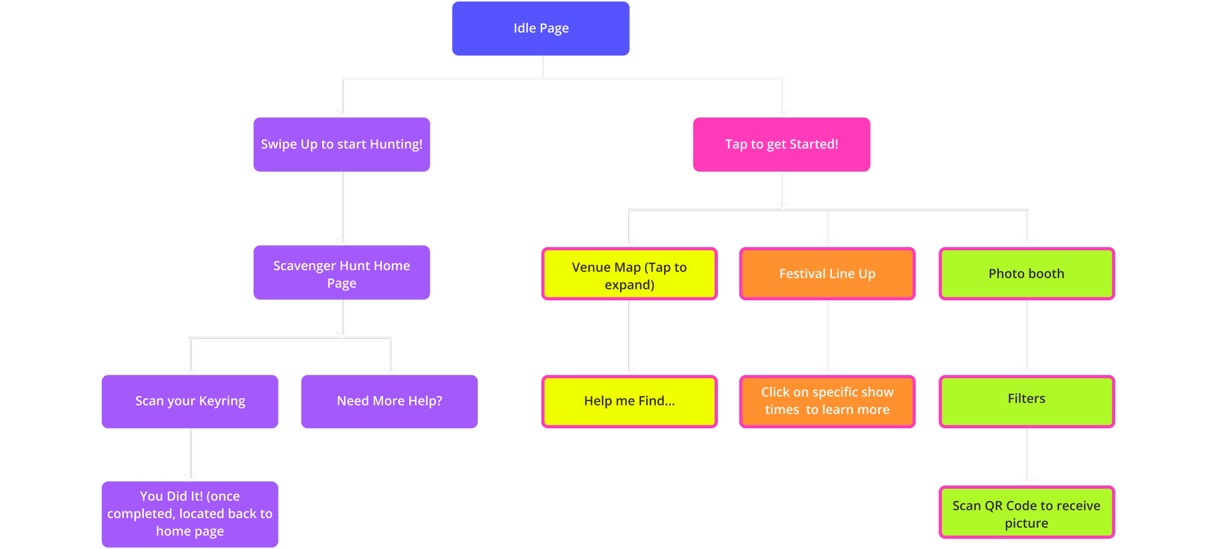
Hi-Fi Wireframes
Testing & Analysis
Overall, navigation was fairly clear and fast for users to understand. The scavenger hunt navigation was not very intuitive. The arrows used during the hunt were unclear and did not clearly communicate their purpose. Users struggled to locate or understand the scan function for the hunt. Some users felt stuck on the home page while trying to begin the scavenger hunt.
The Future for GARDN
Our kiosk-based navigation and activity system creates checkpoints for users that serve as a clear and concise medium to communicate information. Page and function navigation are designed to be intuitive for first-time users, allowing for boosted user confidence when it comes to venue exploration and interaction.
The primary challenge of this project was balancing a visually maximal design system while maintaining strong usability and clear information hierarchy. The interface relied on bold colors, expressive graphics, and layered visual elements, which created a risk of visual overload if not structured intentionally. The focus was on creating an engaging and immersive visual experience while ensuring the interface remained intuitive, scannable, and easy to navigate.
In the future for GARDN, we would refine accessibility to ensure that our buttons and color schemes are accessible to a wide variety of users, especially in a night time setting. We would also explore a light-mode interface that would be dynamic with the time of day. Finally, we would expand our technology to include how users would acquire the key chain for our scavenger hunt activity, and also look further into RFID systems and how we could integrate that with GARDN. This means that would include the technology on the employee’s end and what they are able to control behind-the-scenes.
Component Library
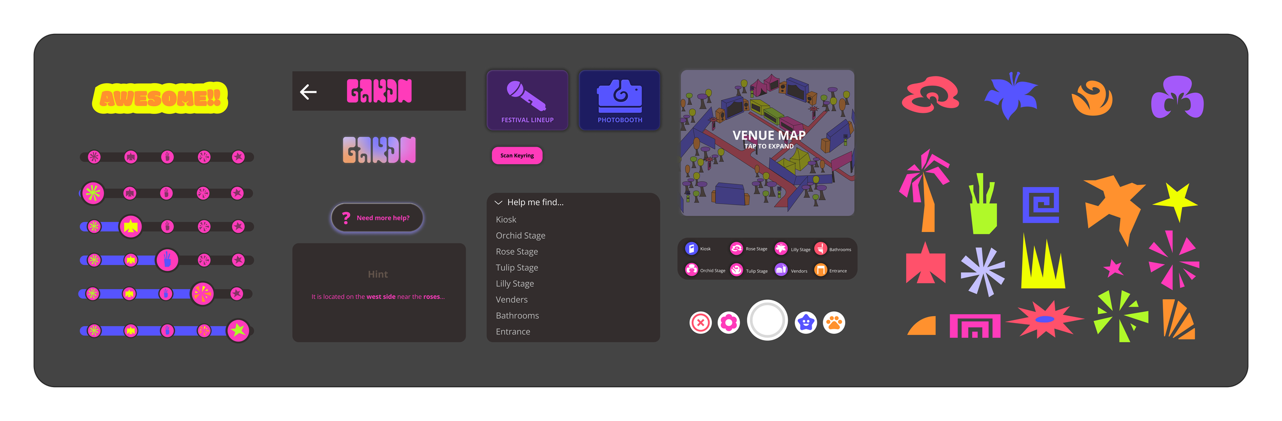
Buttons & Icons
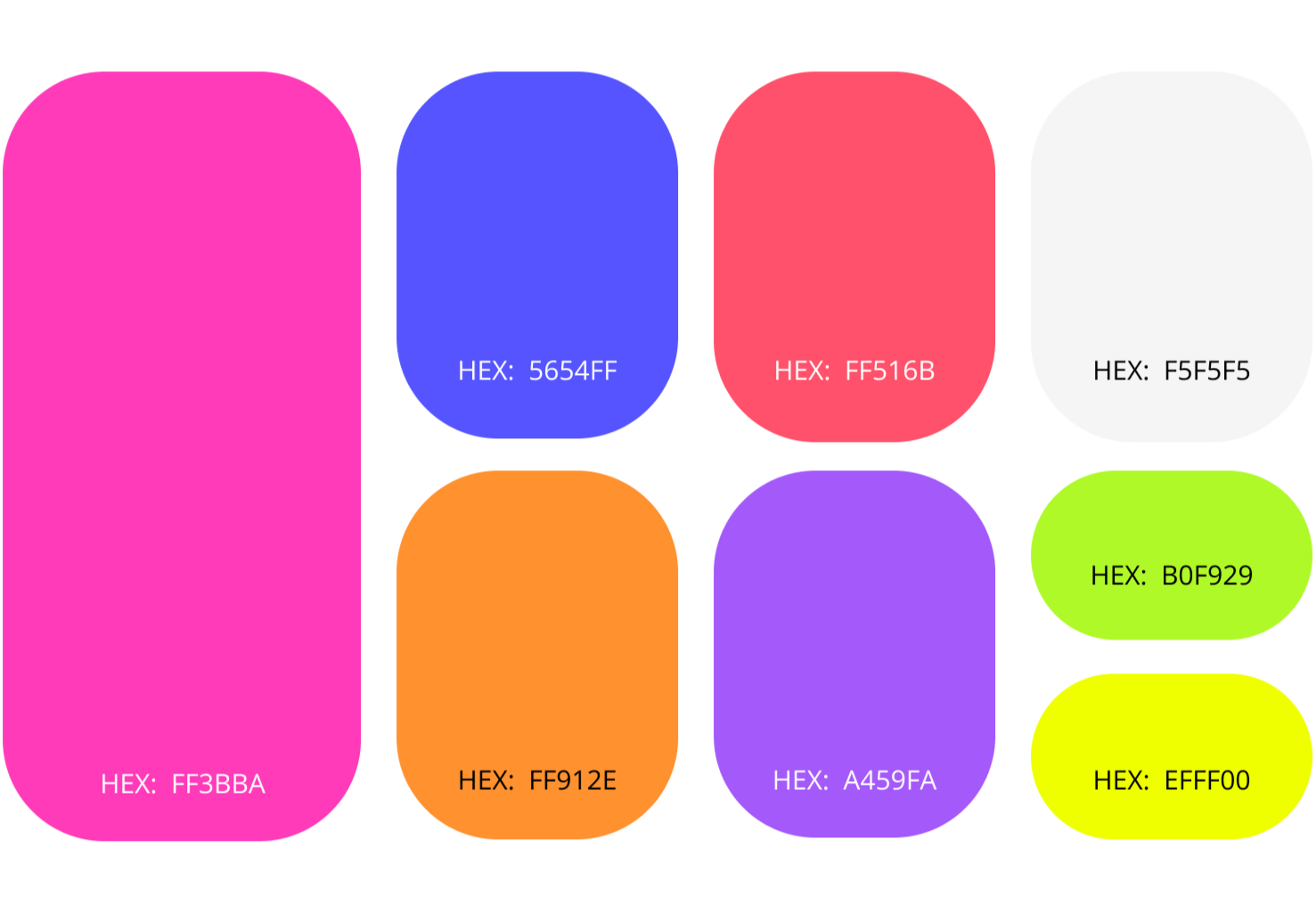
Color Palette