Libby App Redesign
Explore a curated collection of our past work, where imagination meets strategy. Each project reflects our drive to deliver thoughtful, effective solutions.
Libby’s Current Product & Brand
Libby is an app that allows for users to access and borrow ebooks, audiobooks. and digital magazines from their local library. It gives the user the ability to read, sync progress, and download content for offline access across their devices (phone, tablet, or web browser).
The app’s brand features a maroon and teal color palette, and was developed by their parent company, OverDrive. Libby aims to simplify and modernize the digital borrowing process through clean and simple design for intuitive navigation, while also creating a customizable and curated reading experience.
Who Are Libby’s Competitors?
Amazon Kindle
Kindle allows users to purchase and download ebooks, audiobooks, and digital magazines to be accessed anytime, offline, from the convenience of your personal device. It features progress syncing and reading customization.

Hoopla
Hoopla is a library app for users to borrow and download ebook, audiobooks, digital magazines, shows, and music from their local library. They offer paid subscriptions for passes to access premium content and sites, such as PBS and Hallmark.
Epic
Epic is a library app curated for young readers, featuring an assortment of engaging audiobooks and ebooks for English and multilingual readers. It allows for offline reading and is free for educators and students, but requires a paid subscription for families.
Libby’s Target Audience
This app is ideal for individuals that enjoy reading or have a preference to reading digitally and are public library users, and like the convenience of being able to borrow or access ebooks and audiobooks from their personal device, especially if they’re traveling or away from home.
Since Libby is a library app, their target audience is fairly broad, with a larger age range of users consuming different forms of digital media.
Flow Audit & Usability Testing
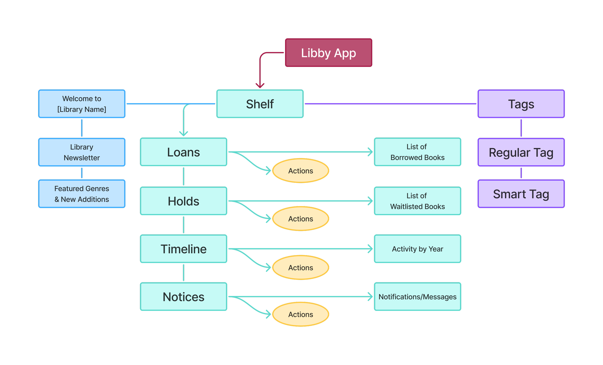
For the current product, users were tasked with the following.
Navigate to the ‘Library’ tab and find a book in the ‘Just Added — Adult’ section and save it in the tag labeled ‘Phone.’
Locate the ‘Phone’ tag and click on the book that was just saved. Then save the book to a new tag labeled ‘Books.’
Assuming that you are already borrowing a few books, go to the page where you would view your books.
The Redesign Strategy
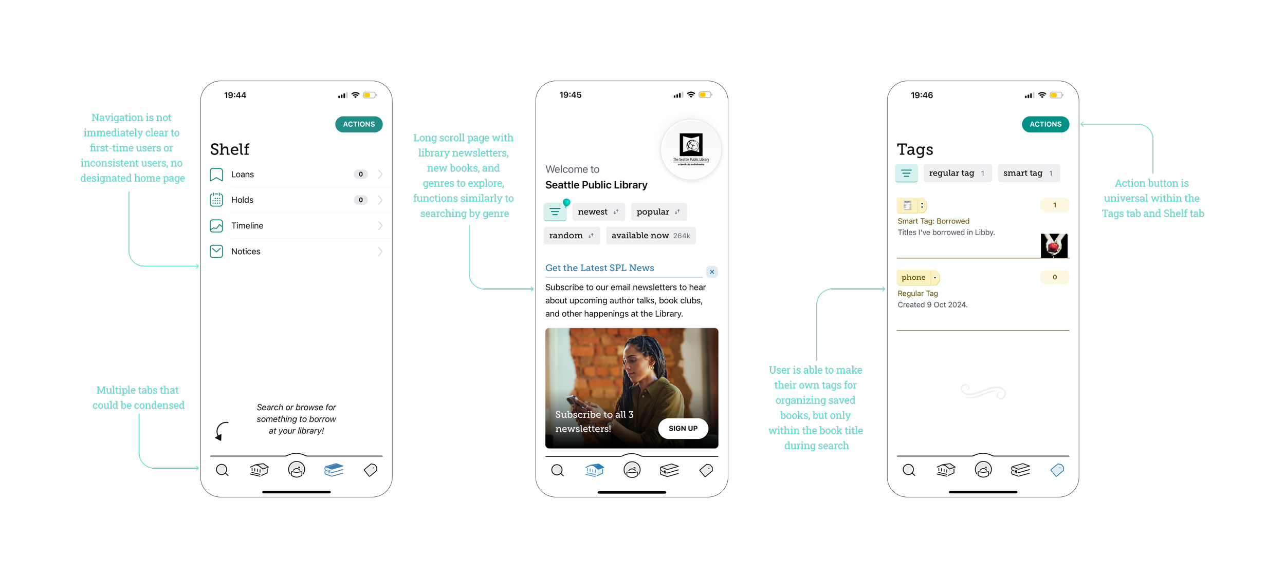
Pain Points
During testing, users primarily used the filter function in the ‘Library’ tab rather than scroll down to explore featured categories and news as intended. Users seemed to understand that adding books to tags functioned the same way as saving an item to an online wish list, but struggled with the tags’ general function. They also felt that the app looked bland and boring, and could use a stronger brand image. An additional pain point that I personally noticed was that there was no designated home or landing page, so anytime a user opened the app, it would always open to the last page they were on.
Opportunities
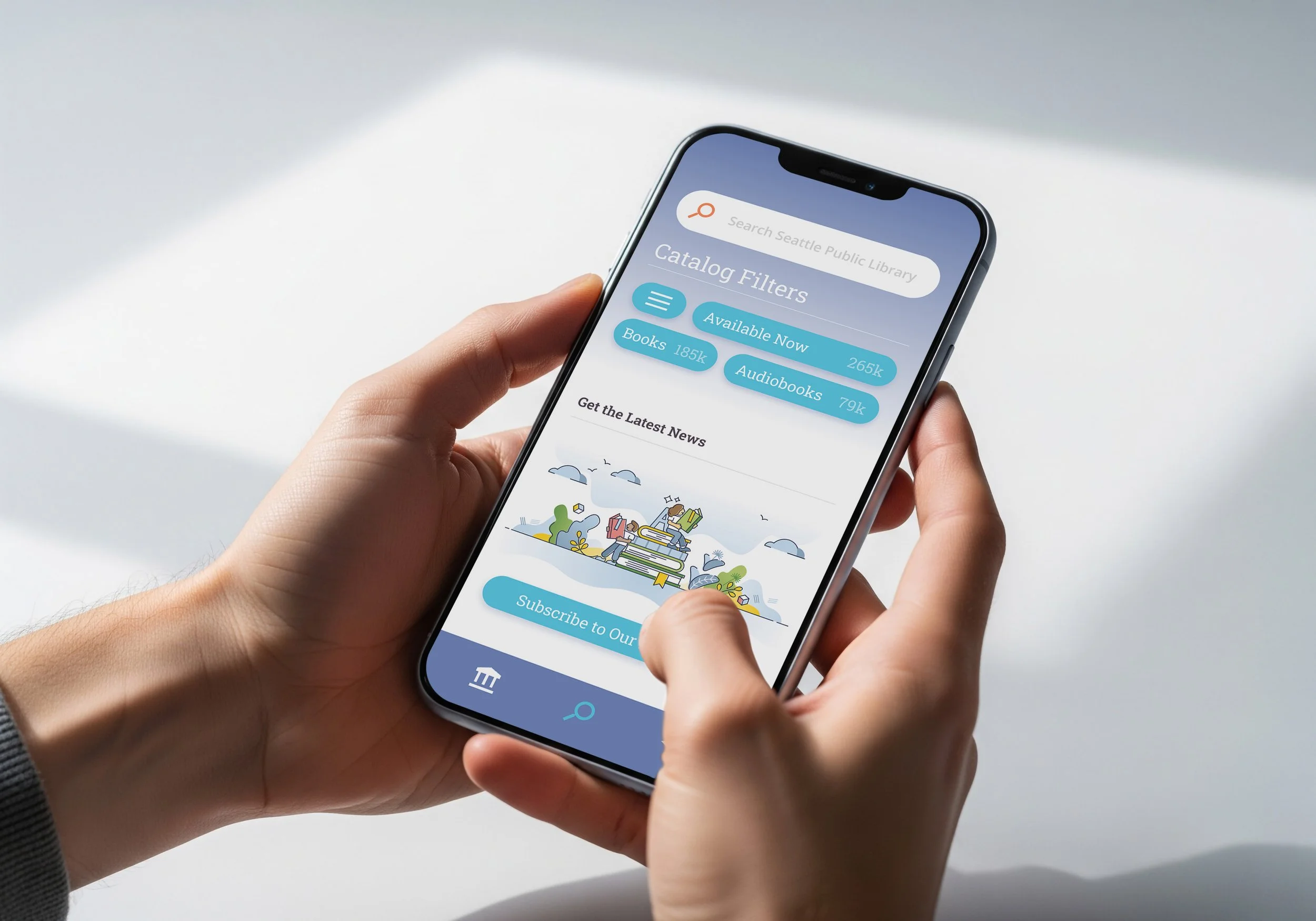
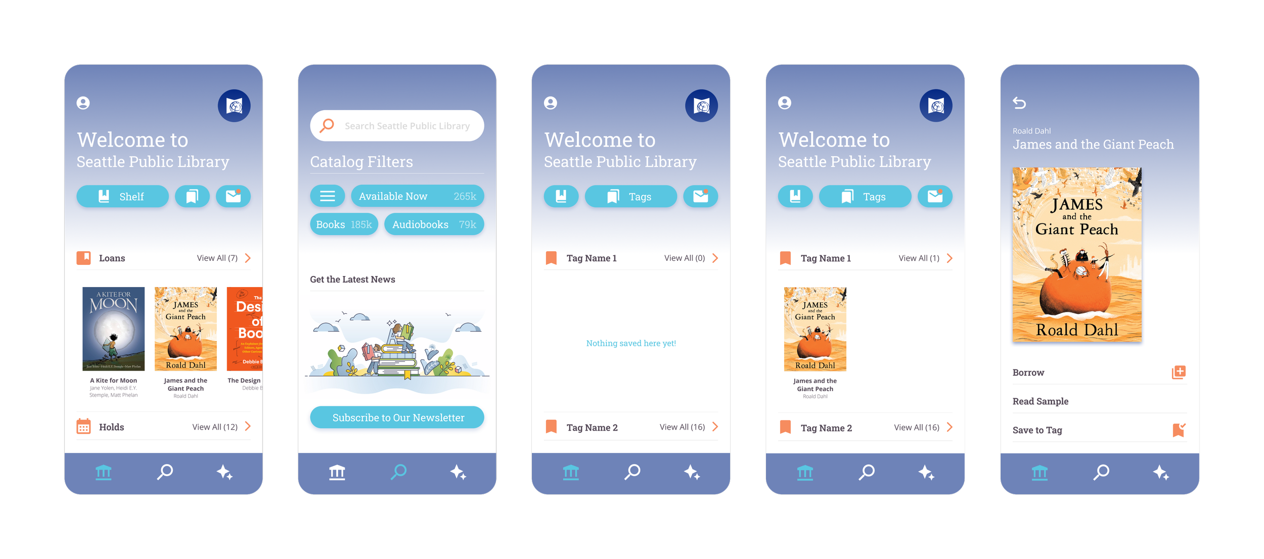
Based on user testing feedback and pain points, a solution could be to combine the ‘Search’ tab with the ‘Library’ tab since users seem to navigate both tabs similarly, and both screens display very similar general information. By also combining the ‘Tags’ tab with the ‘Shelf’ tab, it would make the overall layout and functions more concise, reducing the total number of tabs from 3 to 5. Another solution could be to improve the hierarchy, and to make the app’s features and color palette feel more integrated to create more visual appeal.
Primary Takeaways
Users found that pages were easy to locate, and that the app’s use of icons made everything fairly easy to navigate and understand. Users seemed to like how clean the overall design looked; however, they were expecting a stronger brand image or something more visually interesting. In the redesign I chose to combine existing tabs to make navigation less confusing, to use a different color palette for more appealing visuals, and to use similar icons as it was a strength from the current product.
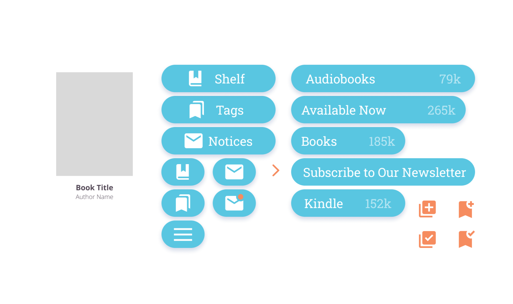
Wireframing
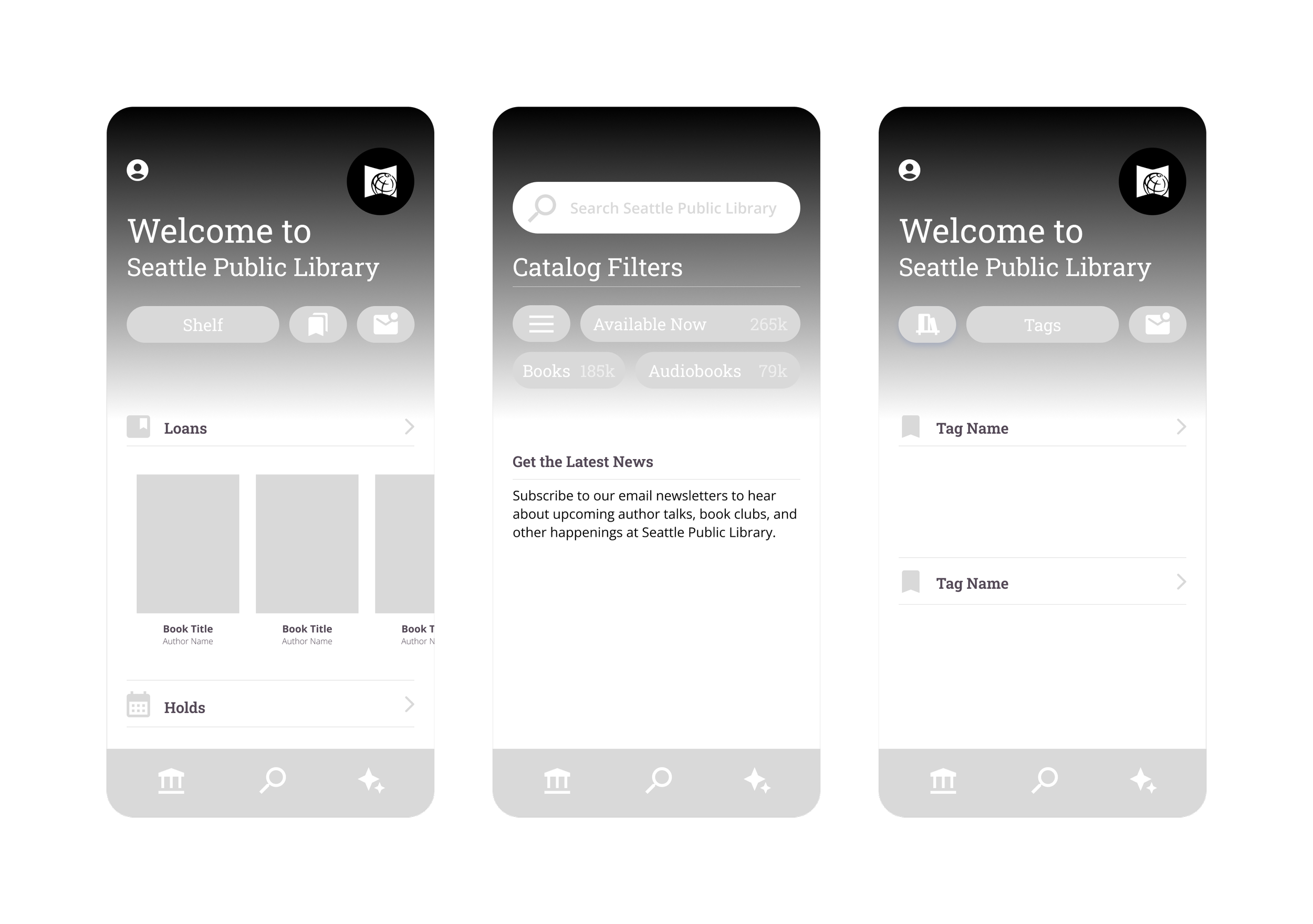
In the low-mid fidelity wireframes, I wanted to emphasize a friendly interface for a large audience by designing pages that were more visually interesting while still being intuitive for users to navigate.
By mimicking the way Libby’s competitors displayed the user’s personal library, and by designing buttons to be larger, it would create a more accessible interface considering the wide age range of Libby users.
Prototyping
I decided to also change the color palette from maroon and teal to light purple, turquoise, and orange for a brighter and more engaging look and feel.
In the redesign, users felt that it was easier to navigate with icons making their respective functions clear and easy to understand. Users also liked the new color palette, stating that it felt clean, modern, and friendly, giving Libby a stronger brand image.